ShopDreamUp AI ArtDreamUp

Deviation Actions


Description
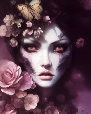
This is the second to my new series! The Animal Within


Model: 

Panda: [link]
Fire Sparks: 


!!PLEASE DO NOT TAKE THIS AND SAY IT IS YOURS!!
~K123B
![[link]](https://www.deviantart.com/users/outgoing?http://3.bp.blogspot.com/-IdUMxhgZKsQ/Tp1qHBxgMRI/AAAAAAAADgc/xRpvgJP_z-g/s1600/Panda_Face_HD_Wallpaper_Vvallpaper.Net.jpg)
!!PLEASE DO NOT TAKE THIS AND SAY IT IS YOURS!!
~K123B
Image size
3000x2083px 684.3 KB
© 2013 - 2024 Kassidy123Beth
Comments19
Join the community to add your comment. Already a deviant? Log In
Your artwork instantly caught my eye and I've got to admit that this is one of the most original human/animal photomanips I've seen as of late. I really love the concept and the fact that you've chosen a panda - I mean how cute is that <img src="e.deviantart.net/emoticons/x/x…" width="15" height="15" alt="
Another strong point of your artwork is the color scheme that you have chosen, which is purple/blue split. It's fairly rare; typically most people use warm/cool or red/blue kind of color split. I think you've managed with color just alright: purple/blue gives mysterious fantasy feel here and doesn't provide darker look although it's a night scene. I particularly like that you tinted panda's and girl's eyes accordingly - it's a really sweet touch. If I were you, I would have also tinted panda's fur a bit further so it doesn't look black and white in the center.
Now, I have some mixed feelings about composition here. I'm not entirely sure whether you intended to make both sides identical in sense of symmetry - if that's the case then I'm not very sure about the background in the right half and practical lack of thereof in the left. On the other hand I quite clearly understand that removing any sort of background would make artwork less interesting to study...so yeah mixed feelings XD.
In any case, what irks me here is the fact that the moon is on the same level line with models' eyes and it's also pretty much same size. It also happens to be the brightest object in the picture. Because of these three factors it creates a disbalance: size, position and brightness shift the focus from from model's face to the right and thus right side draws more attention than its counterpart. It has more compositional weight. If I were to fix it without removing moon entirely, I would resort to reducing its brightness and just repositioning it. Then again, the left side would also need something to balance it, perhaps something like glowing tree outlines or flame like effect so it doesn't appear plain in comparison.
Concerning hair, I think you did a pretty fine job here, especially considering that original model is blond. Of course some extra definition alongside shading and highlighting wouldn't hurt, but it's definitely not bad.
Lastly, the special effects. It goes without saying that I really like the way you retouched the fan. The highlighting on the right side looks pretty much spot on: brighter outline, just maybe more bluish tint on the fan base itself. The left side however pales in comparison because highlights barely stand out against background, thus making fan practically blend into darkness. Just brightening the outlines would be more than sufficient to fix it.
The sparks, love them, very dynamic. It is my personal preference, of course, but if I were to do similar spark effect, I would have used several layers (of varying sizes) in order to achieve cinematic depth. Placing a larger layer in front for example would have given a sort of "3D effect": it would look as if sparks literally surround model. Regardless, background sparks look equally good.
Overall it's a very solid and original work with few minor flaws and you manged everything pretty well. I'm definitely looking forward to seeing other works from this series =3